Hello my fellow DIY-Witchcraft/furniture refinishing enthusiasts! Today I’d like to walk you thru the process of creating a Rainbow-portal witch’s apothecary cabinet! Sounds fun right? It was!

In visioning the perfect home for our new line of Ritual Cleaning Products, Counter Magick, I really wanted to give them somewhere glamorous and unique to live. I thought about some amazing glam brass and glass etagere, but decided that would be too fragile for something as utilitarian as cleaning products (magical or otherwise) and that glass bottles on glass shelves sounded like a nightmare waiting to happen.
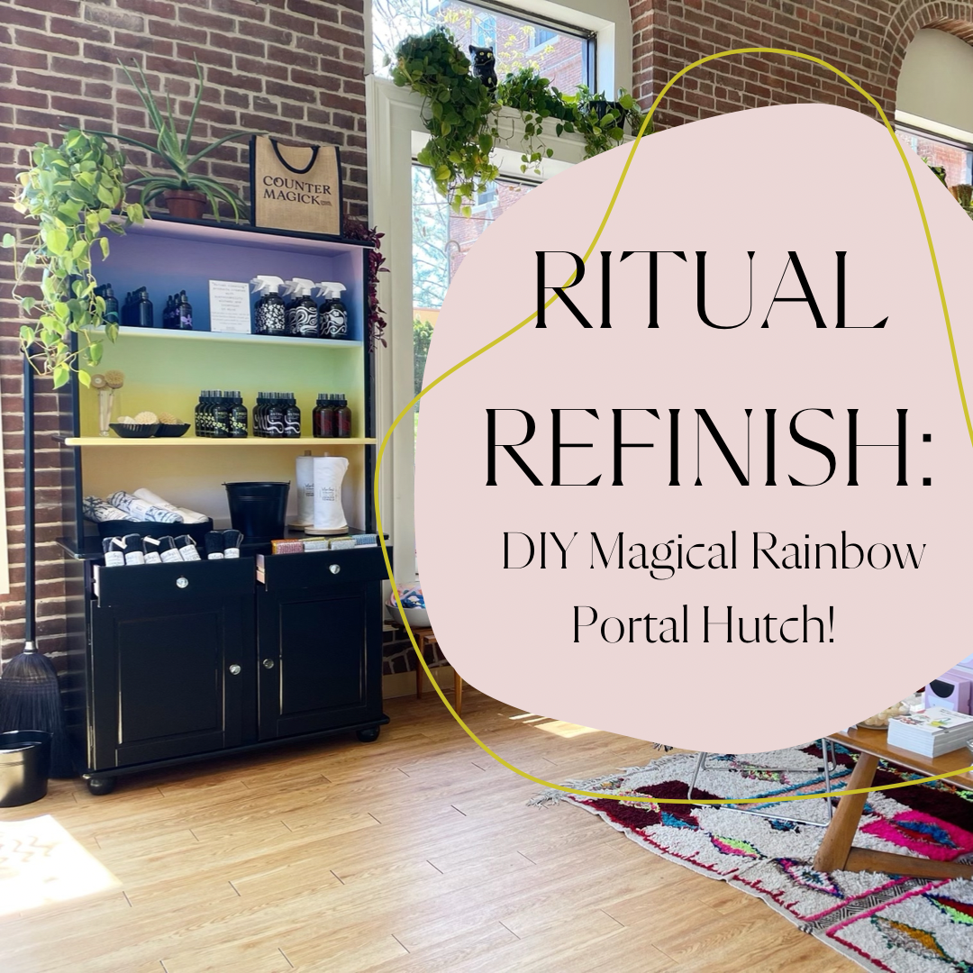
That’s when I decided on a hutch. Something that looked like it could live in a kitchen. Something with a counter-type surface to visually situate the products in the type of environment they are made for. Plus, there’s like a million vintage hutches on CL and FB Marketplace that are made of solid wood and ripe for a refinishing. Most of them lean very country, but after a few days of scouring the internet I found one that was the perfect size and shape for $200 just a few miles from Salem. Paige and I picked her up and named her Dolly after Dolly Parton since she seemed like a hard worker and was a bit top heavy lol.

The idea for a black/rainbow contrast just kind of hit me out of nowhere. Black hutches are pretty trendy right now (new for like $2000) and there were a few photos on Pinterest of black hutches with colorful insides that really inspired me. When I was trying to think of what color I would paint the inside, this pastel rainbow image from a wall mural site popped up and I just kind of decided that was the answer. Rainbows and gradients are a big part of the Counter Magick visual branding, so it felt right.

Okay, so here’s how I did it if you’re curious, which I think you probably are since you’re here.
Couple things up front:
-If you’re like me you will probably find yourself using more plastic than you would normally be comfortable with. However, ziplock bags, saran wrap and disposable paint trays were pretty crucial to my process. I’m sure there are ways of doing it more sustainably, I just didn’t have the time to be able to do this all in a day or two (it actually took me a total of 12 days only having a few hours each day to devote to Dolly) so I had to keep paintbrushes/trays from drying out and save my color combos somehow, and the plastic was the best way.

-Its definitely best to have plan and map out what color paints will go where just so you don’t get confused while you have a million paint colors everywhere.

-The blending process is very trial-and error. I tried a few different techniques, and landed on one that worked pretty well, but I can see there being other ways of doing it that work just as well or better, you’ll just have to play around. Things will differ according to the surface you’re painting on (this was a chipboard backing that wasn’t solid wood), how many layers of primer and the colors that you’re using. I would say start with my technique and experiment from there!
-There are tutorials on how to paint an ombre effect on YouTube and Pinterest that you should watch just to ground yourself in how this works. A lot of them deal with only two colors so it won’t translate 100% but it was helpful to see a similar process before I started.
Okay here we go!
Step One: Gather Supplies

- Tarp or Drop Cloth
- Sandpaper (120 grit and 220 grit)
- Wood filler
- Tack cloth (this is a sticky cloth that you use to get the dust from sanding and any other particles off the surface)
- Painter’s tape
- Primer, ideally one can of dark and one of white
- Paint- I highly recommend Benjamin Moore Advance for furniture painting. It has great coverage, and a really nice finish without having to do a lot of prep.
- Rollers (get lots of roller sponges!)
- A variety of brushes/sponge brushes
- Paint Trays (enough for all of your main colors)
- Other vessels for mixed colors. I used some plastic plates we had laying around that never got used for anything.
- Makeup sponges, like A LOT of makeup sponges.
- Ziplock bags and/or Saran wrap. This is for keeping your brushes and paints from drying out between coats.
- Post-its (Optional)
- Canvas or another “practice” surface. (Optional)
*Quick shoutout to Waters and Brown in downtown Salem, (and specifically the super-helpful Adam who answered approximately one million questions) because I got everything I needed there, and the customer service was A+.*
Step Two: Prep
Take apart and sand: Dolly was already in two pieces, but I did take all the doors and knobs off. (It’s much easier to paint furniture that’s disassembled.)

Since I decided to the black part first, I taped off anything that would be rainbow so I didn’t accidentally put three coats of black paint on something that would end up pastel.
The outer surface was pretty smooth, and I purposely bought a nice primer so I didn’t do too too much prep, but the inside (the rainbow part) was kind of a mess. Especially since I ended up having to ditch the top doors which caused a couple of issues. Originally the cabinet had cute glass doors on top. I loved the look but (in addition to being kind of impractical in a retail setting) I realized midway through the priming process that I would have to figure out how to remove the glass to paint the inside of the doors and after experimenting a little it seemed like I would have to choose between keeping the doors and keeping all the blood in my body and I chose the latter.
However, that meant that I had to remove the piece of wood down the center that the doors connected to. (I used a random saw we had laying around.) There was some surface damage that I needed to fill in with wood filler…. What I found out is that I am not very good with wood-filler. But I did my best and it turned out fine, not perfect, not great, but fine. You kind of just slap it on with a putty knife as smoothly as you can, let it dry, and sand off the excess.

Okay so you’re (almost) ready for Prime time! Just give the whole surface a quick sanding with 120 and then 220 sandpaper and you’re ready! I did a dark-primer for the black part and a white primer for the rainbow.
Step Three: Paint the Outside!
For the black outside part I did one coat of primer and two coats of the black. Again, based on a recommendation from a professional painter I use Advance paint and I think it works really well. I also mixed some of our Pyrite essence into the black paint to charge it up with some abundance vibes.

Step Four: Embody Rainbow Brite!
Choose your colors wisely! I had our resident color magic witch help me pick out the colors because I would’ve probably just picked based on names alone lol. I stand by that being a good way to infuse your project with intention tho! We went with this: Summer Blue, Morning Sunshine, Sundance, Pink Quartz. Don’t those sound nice? What I will say is that my inspo images are softer and more pastel than what I ended up with so consider that you’re going to be doing a few coats and things may end up a little more saturated than you want.
Now for the colors, I used Benjamin Moore because that’s what you can get $6 sample jars of and that’s all I needed since there were so many colors. It’s not as nice to work with as Advance but much more cost effective since I was buying 6 different colors.
I bought a couple of canvases to test out my colors and how they would blend. This step is 1000% optional and maybe not even that useful since canvas is a completely different surface than wood but what can I say, I felt called to test it out and canvases were on sale at Michaels.
Okay are you ready to make it RAIN…BOW?! In the end, I worked with 13 different paint colors. THIRTEEN you may ask? Yes, 6 main colors, 5 to blend those together, and then 2 that I added at the last minute to help blend more gradually. You only need to buy the 6 main colors because you will make the other 7 yourself by mixing the 6 main colors in various blends. In case that makes no sense maybe this will:

Your first coat will be for coverage. I started with the purple. Then the blue. Then I experimented with applying the equal blend of the two in the middle. I used a makeup sponge all along the top and bottom of the blended stripe to soften the edges. Since the main colors will probably be dry, it’s probs not going to blend that well. This is just the first coat so don’t be discouraged if the blending isn’t great. It’s mostly about practice and laying down some good coverage over the primer.


Now again, I used makeup sponges as my blending tool but you could definitely experiment with different kinds of sponges or brushes! I tried a few things and the makeup sponges worked the best for me. Perhaps its because I lived thru the great sponge-painting epidemic of the early 90’s? Either way, with this many colors I went through a lot of sponges so prepare yourself for that. (I think it was around 40-45 in the end.)

I let the first coat dry overnight, but you could do shorter depending on what your paint cans say.

For the second coat you’ll really want to have a solid plan because the easiest way to blend is to work while all three colors (the two main and the blend of the two) are wet. So paint the outer sections of the main colors first, paint where the two colors meet last, and then go over that seam with the blended color. Then blend blend blend! I did it in sections since the paint was drying pretty fast. It made lining everything up a little more challenging, but again, with some trial and error you’ll get there.
The thing that I learned was that where there are two very different colors, as is the case here with blue and purple you may want a couple of different versions of the blends. I needed a color between the purple and the equal parts blend color to make the blend as gradual as I wanted. Keep in mind that any extra colors you do will require you to do the same process including a blended color. So for the top I did a third coat of just purple and the equal parts blend, went over that seam with a purple-heavy mix and then blended both sides. It was a little maddening but I figured it out. I did the same thing on the bottom with the orange and pink. Thank Goddetc the middle green and yellow colors were so similar that they blended nicely with just one blended color.
Once you’ve blended all the colors WALK AWAY for a while. At this point you will have been staring at it so long you won’t really see things clearly. Plus, you need everything to dry completely before you really know how well it blended. If you don’t take a break here you will be tempted to keep putzing with it and will probly screw something up. Ask me how I know lol…
The next day I decided I was happy enough with the rainbow and so I went thru and did some touch ups with the black. I painted the inside of the drawers purple with some extra paint I had and put one coat of a matte sealant on top of the rainbow part to prevent it from getting scratched or chipped.

Finally, I screwed in some new knobs for the drawers and doors, re-attached the bottom doors and viola! A rainbow portal is born!

Some final thoughts:
This project was a little expensive, but worth it. The supplies for the makeover cost more than the actual cabinet itself. All in all I spent about $250 on supplies and $200 on the cabinet itself. The new knobs were another $40 (around $9 each).
This project was challenging, but doable! Things did not always go my way, but as long as you remain flexible and committed to the “trial and error” part, you’ll be fine. If you are easily frustrated, this may not be the project for you. Also, you can definitely do it with less colors! For me the full ROY G BIV felt right, but less colors will be much easier to navigate.
This project was a spell! And guess what? There's a million ways to make all DIY projects into spells! What could be witchier than transformation? In addition to creating a vision board, intentionally picking the paint color names, and adding the Pyrite essence I also made sure I was always in a good mood when I worked on her and listened to music that helped me get lost in the process so that I could focus all of my best energy into the work. So much intention goes into something like this it’s the perfect opportunity to infuse it with magic!