Hello! Today I would like to talk about design challenges. Chances are, everyone runs into design challenges every once in a while. If you are a renter (like me) then you run into them often.
The combination of a limited (or very limited) budget and the constraints of renting can be extremely frustrating when trying to improve your space and love where you live.
Luckily, I’m here to say that all hope is not lost! Even the biggest design challenge can be made to tuck tail and run away whimpering when confronted with the powers of the mighty HausWitch! (Or you. You can probably handle it yourself, it’s not that tough)
Here’s a love story for inspiration:
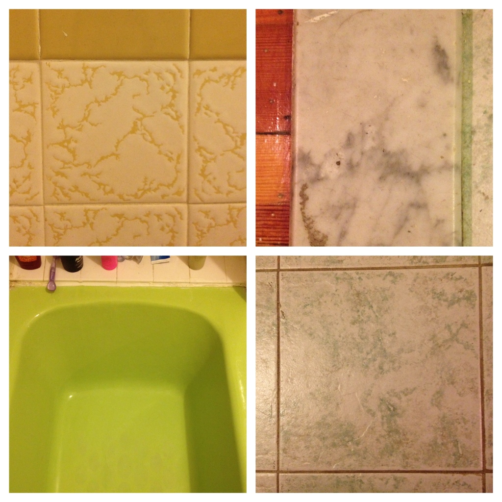
Girl meets boy. Girl falls for boy. Girl and Boy decide to move in together. Girl apprehensively leaves her tiny witch haus to move in to a place with a BRIGHT GREEN BATHTUB surrounded by a sea of tile in THREE OTHER, DIFFERENT SHADES OF GREEN. Girl still loves boy but HATES her new bathroom. The end.
That’s right folks; there are no less than FOUR DIFFERENT shades and patterns of green tile in my bathroom.*
Obviously, this was no reason to not rent an otherwise wonderful apartment. It is however, a design challenge. So here’s what I did:
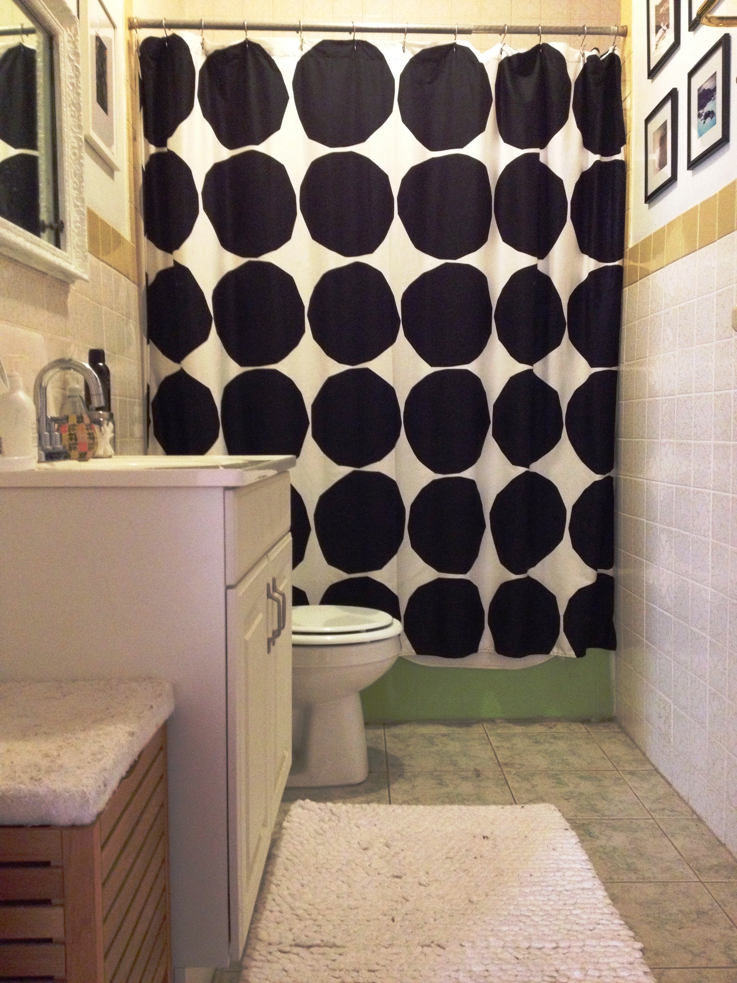
First, I decided on a shower curtain with a bold, graphic print to distract from the bathtub/tile. Shower curtains can be crucial in decorating a bathroom and usually, they're pretty cheap. The previous tenants used a shower curtain with a few different greens in it to coordinate with the rest of the bathroom, but to me it just made everything worse. So I went with the Kivet in black and white by Marimekko because I felt like it was the visual equivalent of a sucker punch to that nasty green bathtub.
I got the inspiration for the black and white color scheme from a piece of decorative paper I came across on a recent trip to Iceland. I liked how the green was there, but was overshadowed by other colors and textures.
Then, in keeping with the Icelandic theme I hung a few photos from my trip. Iceland is so beautiful that I knew these pictures would draw attention away from the tile. I chose these four because they have green in them- but subtly enough so that they eye doesn’t really connect it to the tile. Also, since I just printed these Instagrams straight from my computer this project was super cheap. If you don’t have a printer at home you can use Printstagram and get 24 4x4 prints of your Instagram pictures for only $12 I’m thinking I will upgrade my own prints through Printstagram at some point actually.
So, let's review:
Distract from the ugly with bold prints and pretty pictures+ keep the color palate neutral and use texture to create visual interest=
So what did this all cost? Well, let’s see.
$20 Frames for Iceland photos (Came in a package of 4 at Michaels)
$5 Wrapping paper from Iceland
So about $55 for a bathroom de-greening. Proving that a room can be made to look very different (and hopefully a lot better) with less than $100!
What do you think? I’d love your feedback!
* Depending on your screen that green bathtub may look like it’s a somewhat attractive shade of green. I assure you, it isn’t.


